2026 WA Day Re-Brand
Overview
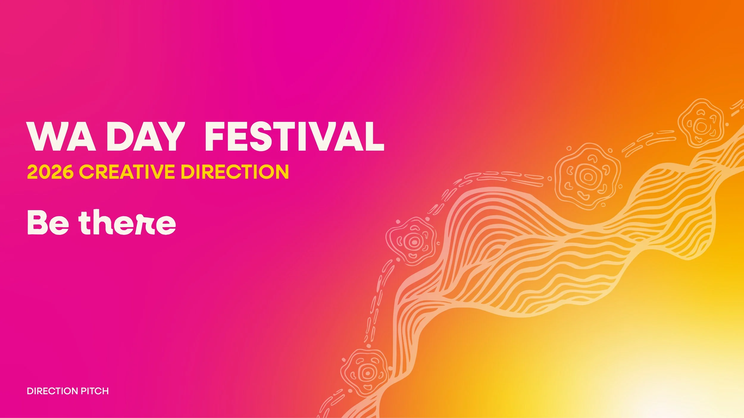
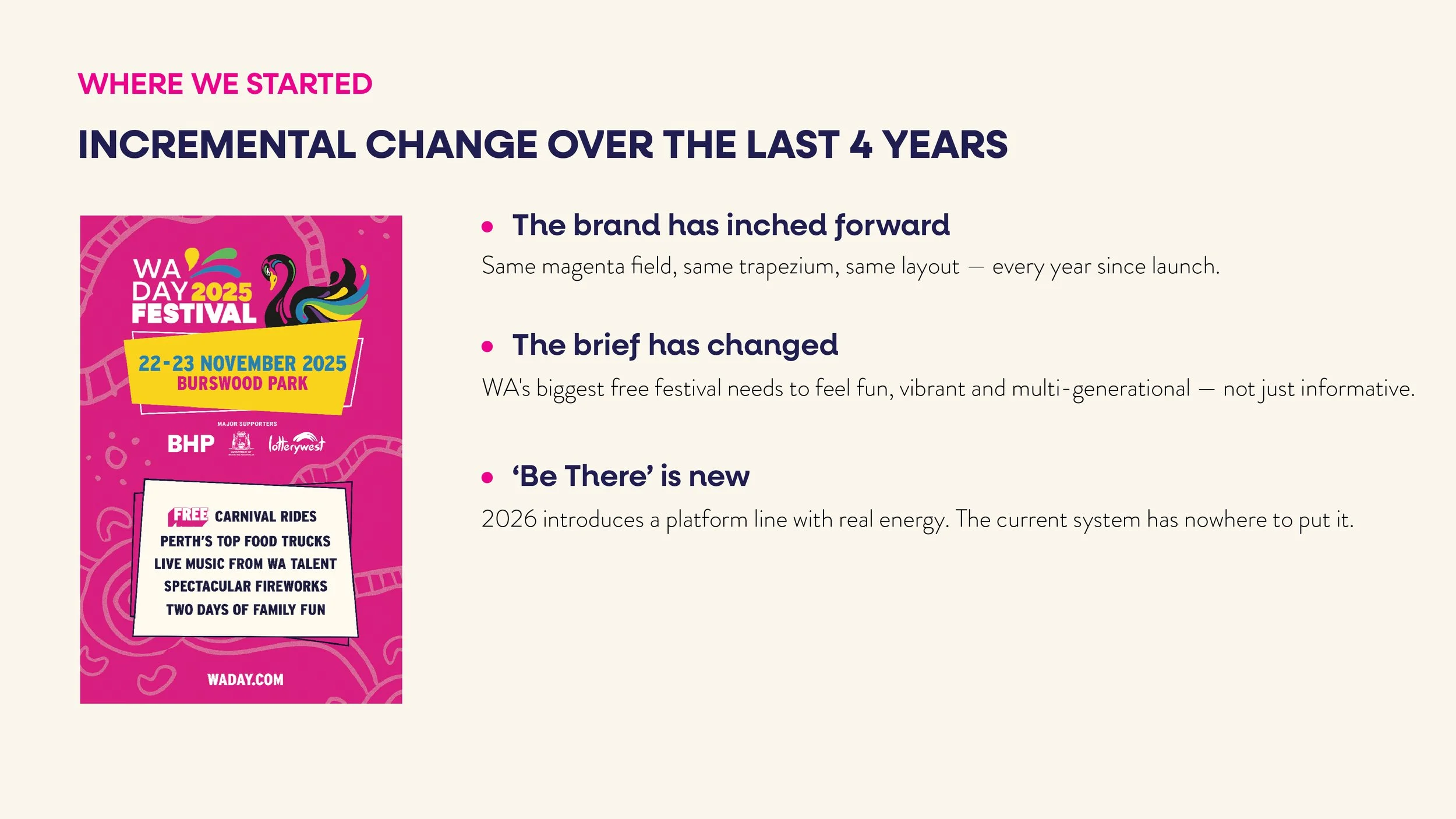
For 2026, I led the creative direction on a proposed evolution of the WA Day Festival brand — moving it beyond a system that had barely shifted in four years. The identity had inched forward year on year rather than actually moving: same magenta field, same trapezium, same layout since launch, while the Festival itself had grown into something that needed to feel fun, vibrant and multi-generational rather than just informative. The pitch introduces a platform line, a redrawn lock-up, and a two-mood colour system built to carry the Festival from sunset through fireworks.
Approach
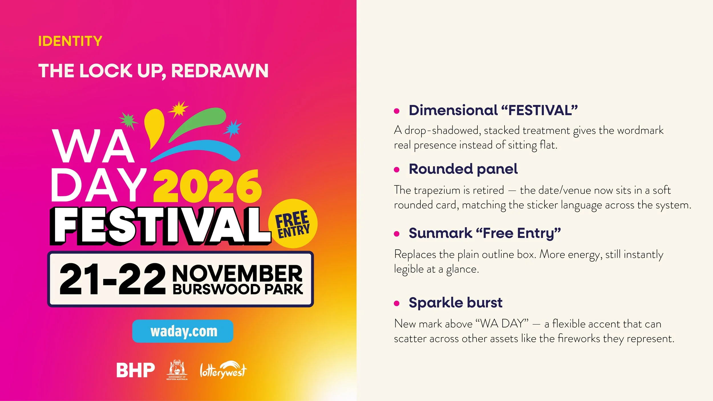
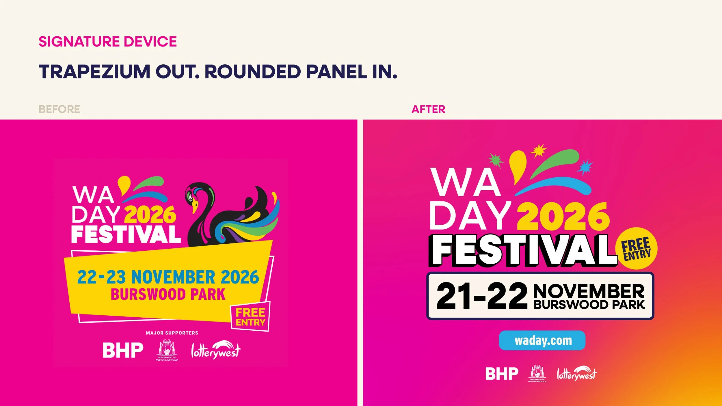
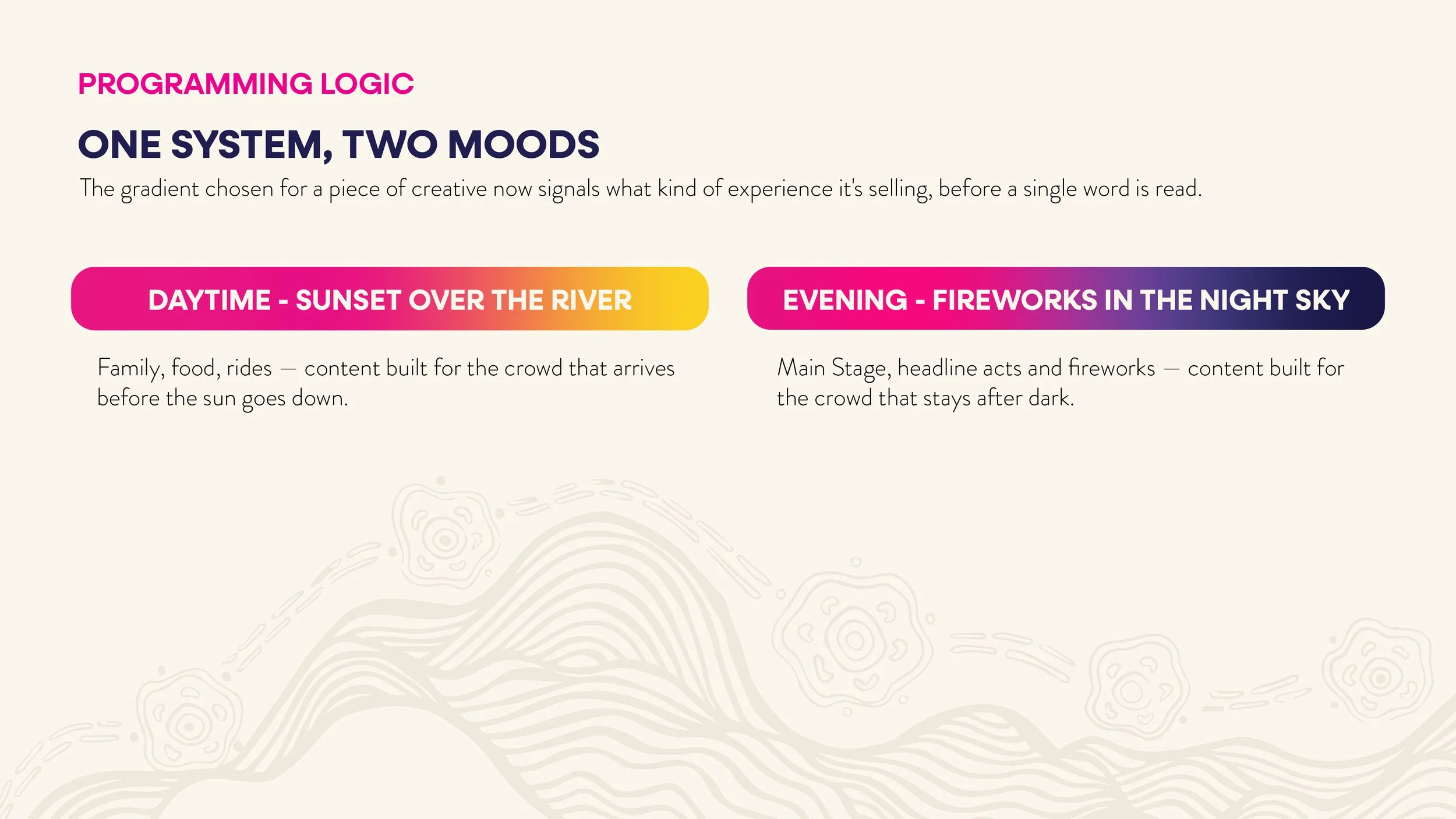
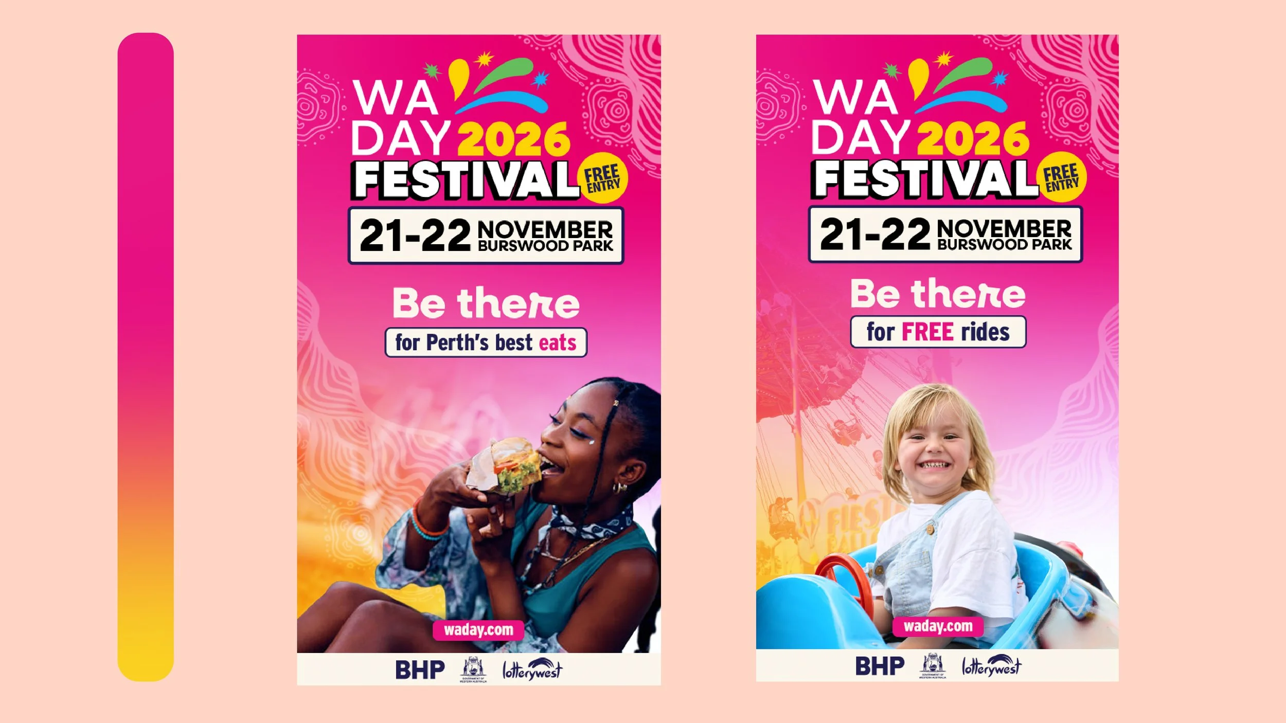
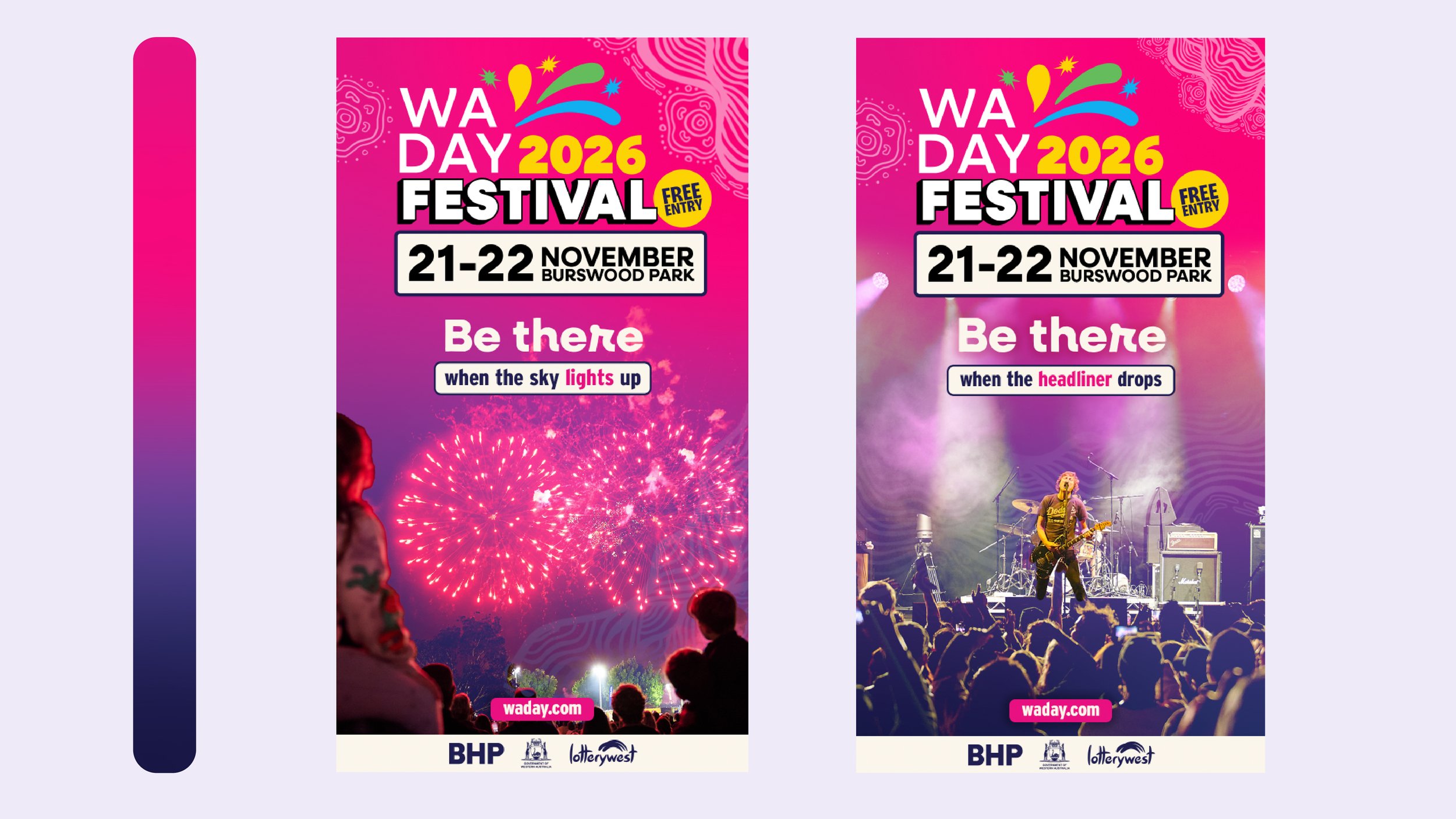
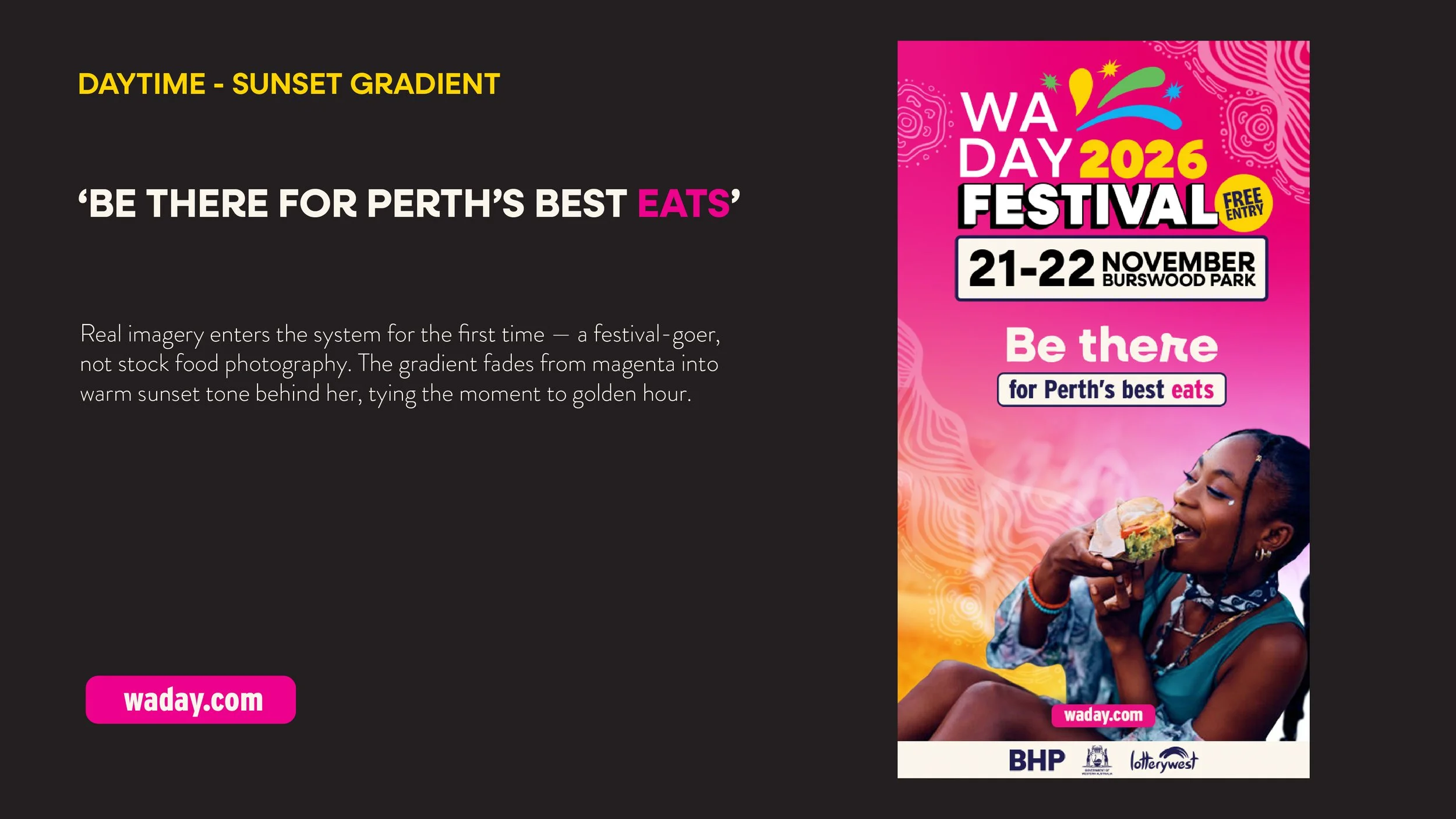
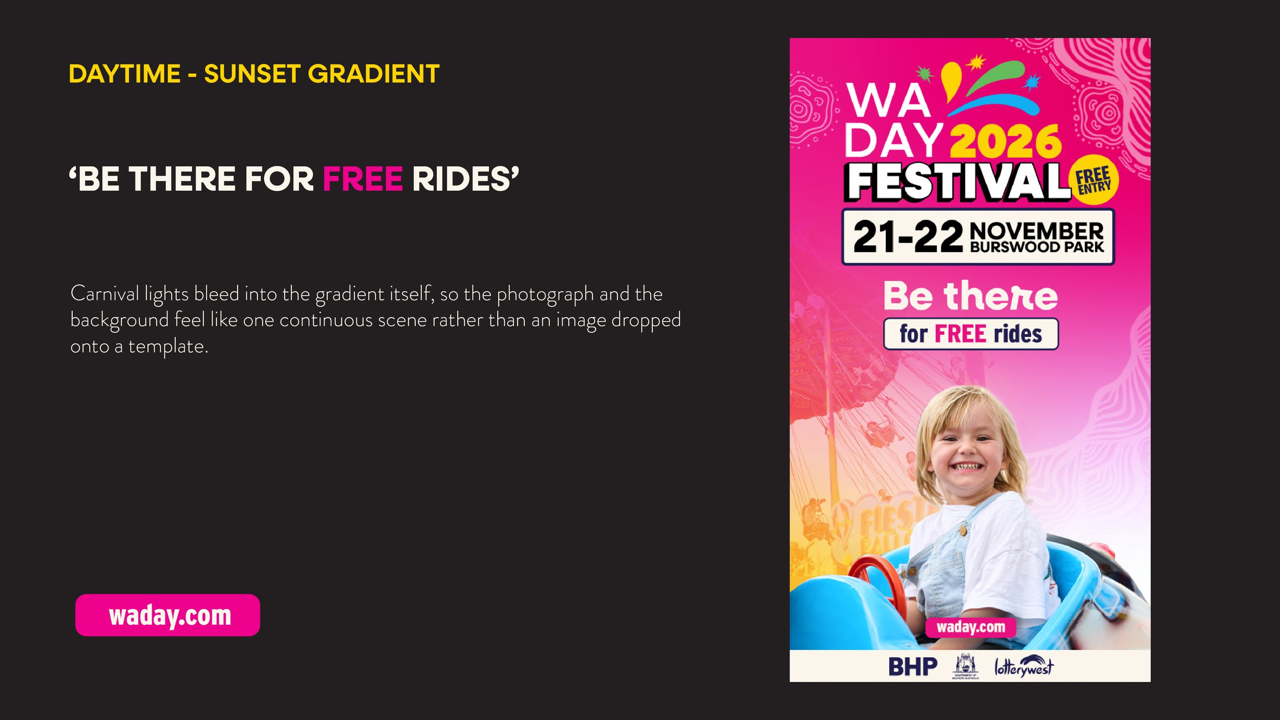
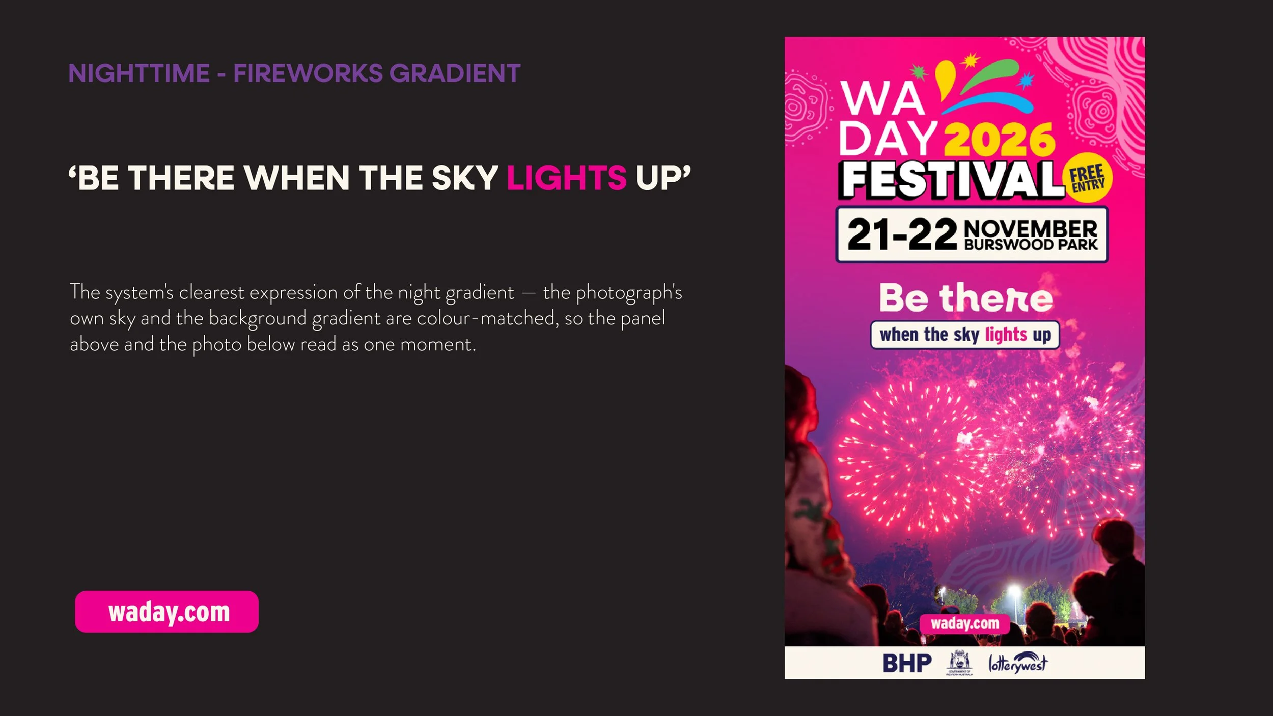
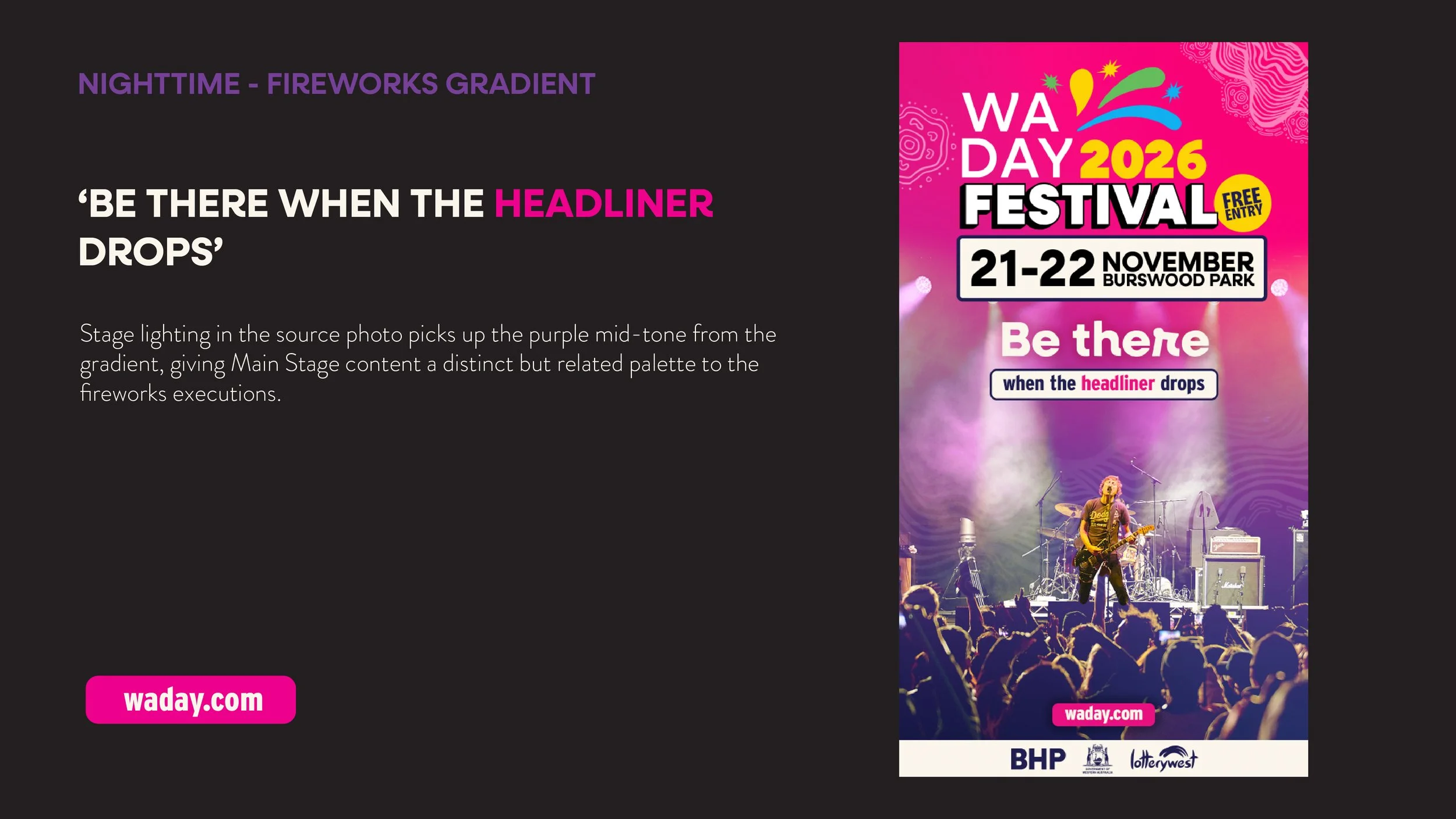
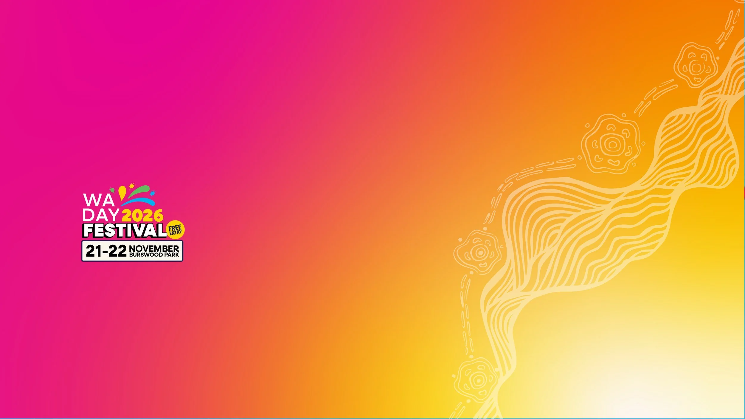
I started by pinpointing exactly where the brand had stalled, then built a system flexible enough to keep moving with it. Magenta stays as the entry point, but two signature gradients — Sunset Over the River for daytime programming, Fireworks Night Sky for evening — now signal a piece's mood before a word is read. I redrew the lock-up with a dimensional "FESTIVAL" treatment, retired the trapezium for a rounded panel, and added a starburst "Free Entry" mark plus a sparkle accent that scatters across assets like the fireworks it represents. The platform line "Be There" moves to the front of every key asset, each paired with a specific, concrete reason rather than a generic call to action — for Perth's best eats, for free rides, when the sky lights up, when the headliner drops. Real festival photography, colour-matched into the gradients so the panel and the photo read as one continuous scene.
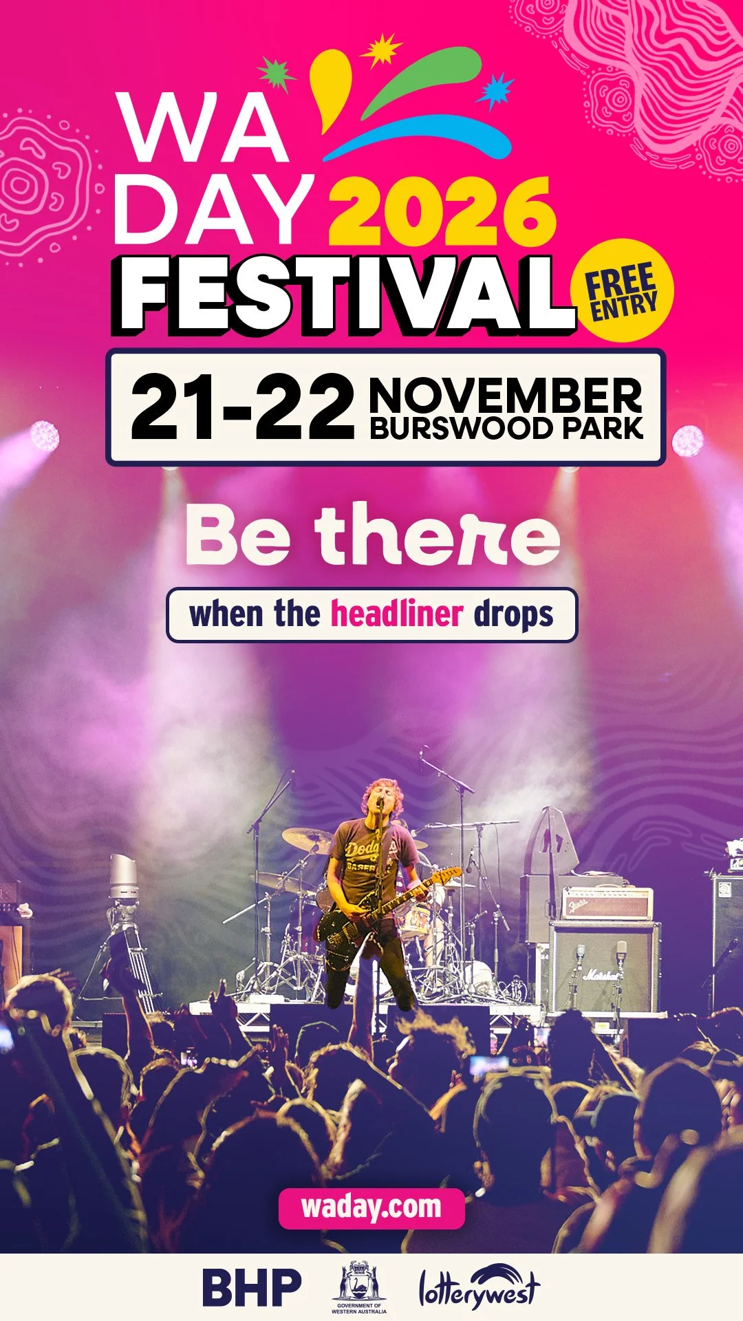
Re-Brand Pitch